// case study · lekta ai platform · conversations module
Tagging Panel
Redesigning annotation so teams stop losing the conversation they're tagging.
- role
- Senior Product Designer · sole designer
- timeline
- ~1 month
- team
- CTO · backend devs · annotation team
- company
- Lekta AI — conversational AI SaaS
- scope
- redesign of an existing MVP module
// problem
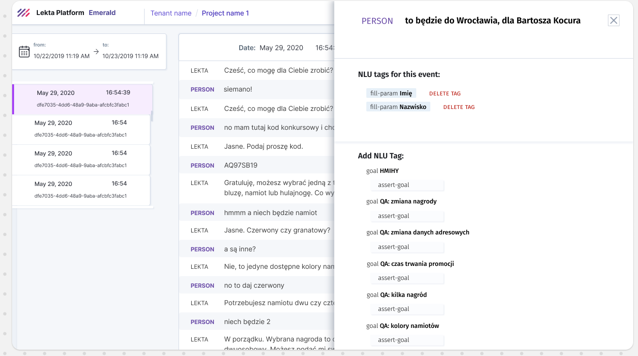
The tagging flyout covered the conversation being tagged, and a flat alphabetical tag list made analysis slow for annotators working at scale.
// approach
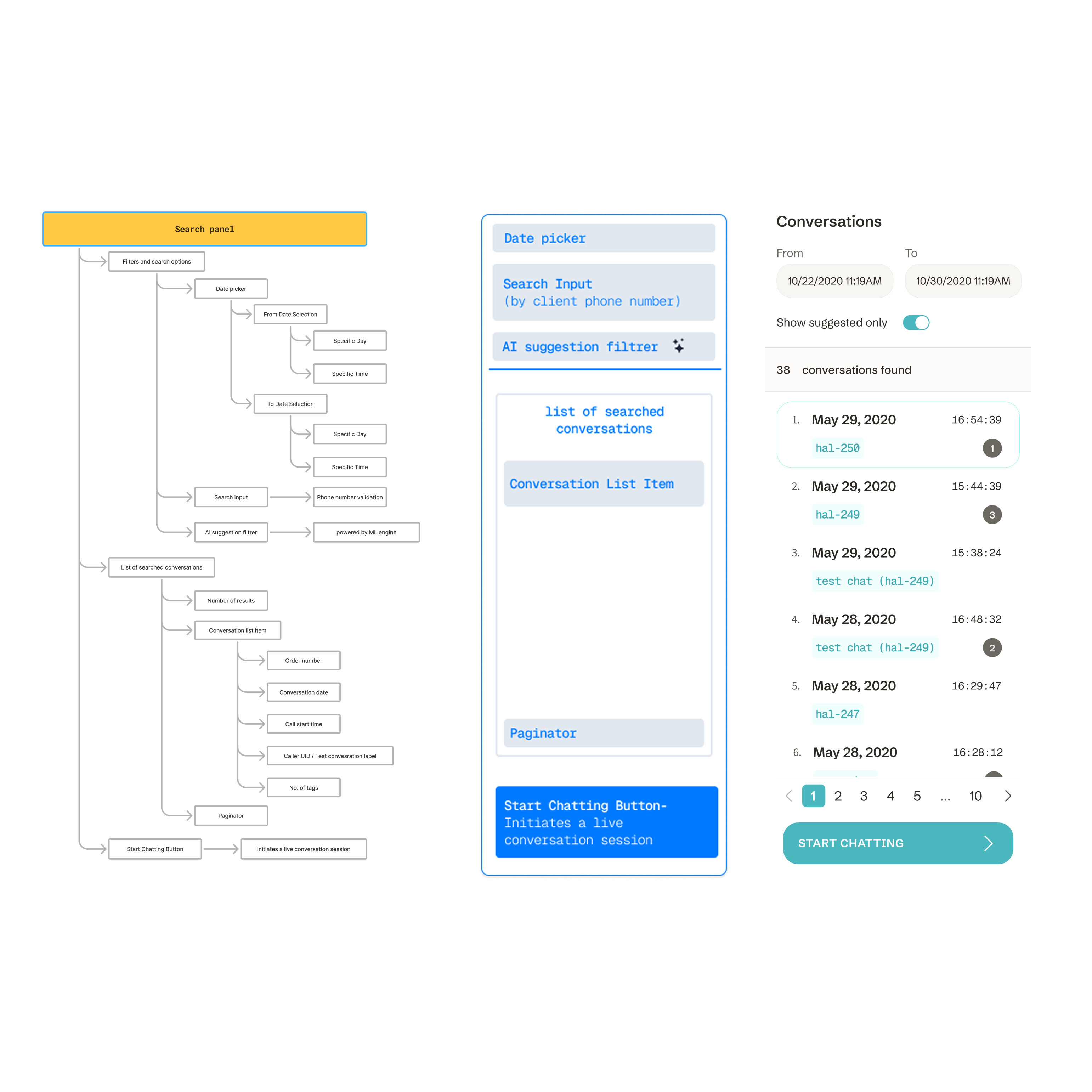
A side panel instead of a flyout, a categorized and searchable tag list, and tags surfaced directly on the conversation list and individual utterances.
// outcome
Annotation without losing context, components reused across the platform, and a consistent experience aligned with the design system.
fig. 01
context
Tagging Panel is a sub-module of Conversations — Lekta's internal tool for reviewing and managing bot-user interactions. As part of the broader AI platform, it helps teams label real conversations to improve model training. Labels feed directly into intent recognition — the quality of tagging shapes the quality of the bot.
// who worked in it daily
data annotators
labeled training data every day — needed a faster, consistent process
ai researchers
analyzed tagging results and data quality impact on the model
designers & pms
monitored annotation progress and quality to predict model changes
r&d team
used results in experiments improving intent recognition
fig. 02
problem
The tagging UI covered
the very thing being tagged.
// constraints
- ~1 month of design time
- backend node structure was fixed
- full compliance with the platform's design system
- no direct feedback loop with end users
- rigid panel architecture limited layout and interaction options
fig. 03
process
// reasoning trace — each step follows from the one before
Audit of the existing MVP
I started by mapping the key UX problems and inconsistencies with the rest of the platform. The main offender was obvious fast: the tagging flyout broke the user's context by covering the conversation view.
◈ more detail◈ collapse
The audit also surfaced smaller debts: inconsistent spacing patterns, ad-hoc components that didn't exist in the design system, and interactions that behaved differently than in sibling modules.
Understanding the tag structure
Working sessions with the CTO and backend developers — how tags map to data nodes, what the system can and cannot do. Design decisions had to respect the backend's fixed node structure.
◈ more detail◈ collapse
This is a pattern I repeat in every complex project: understand the system deeply enough to know which constraints are real walls and which are just defaults nobody questioned.
Side panel + categorized, searchable tags
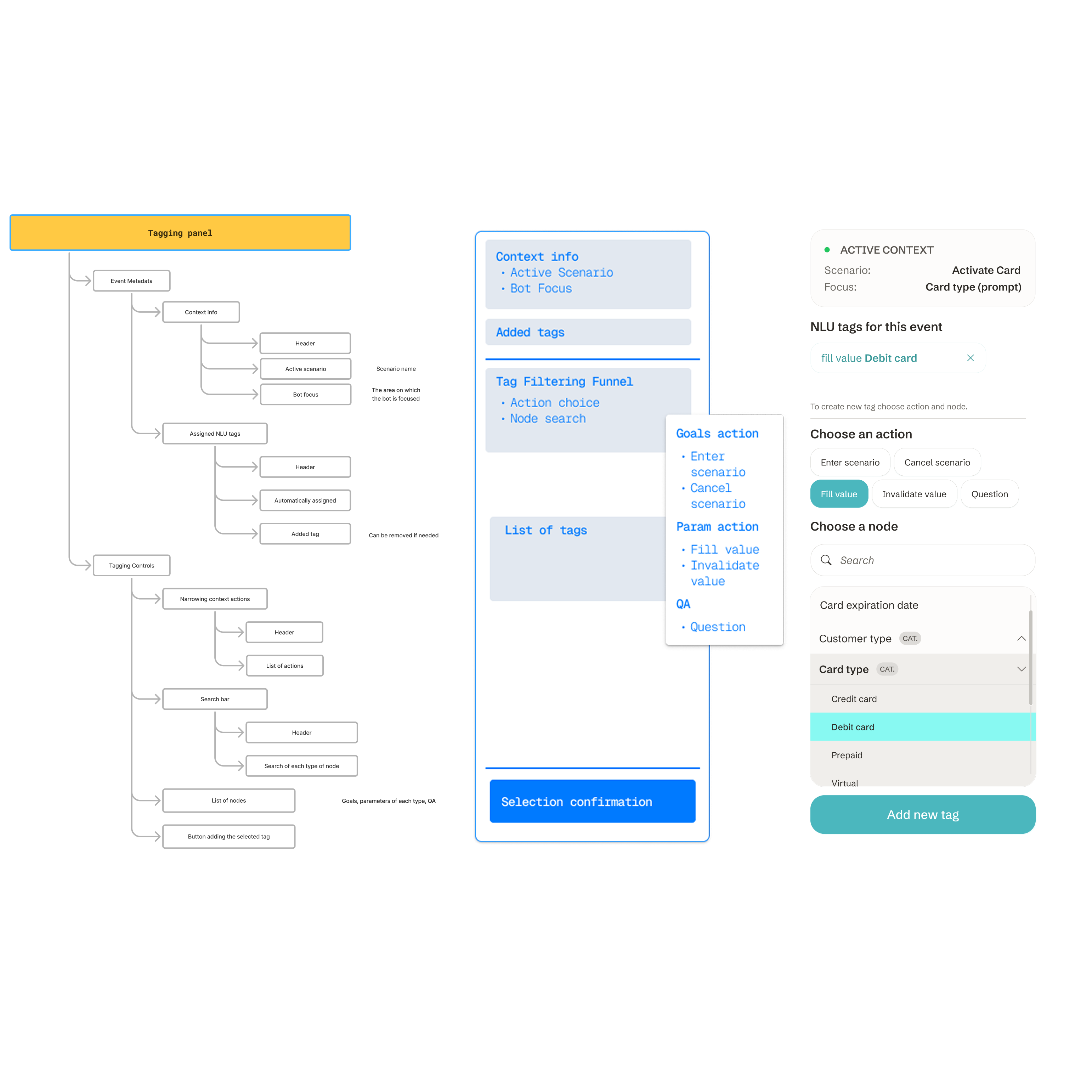
The flyout became a side panel that never covers the conversation. The flat alphabetical list became categorized groups with search — built as a shared component, reused later across other platform tools.
◈ more detail◈ collapse
Categories came from how annotators actually thought about tags — by conversational function, not by name. Search was designed for recall (partial matches, category hints), because annotators knew roughly what they needed, not the exact tag name.
Tags visible in context
The biggest workflow change: tags became visible directly on the conversation list and on individual utterances. No more opening each conversation to check what's inside.
◈ more detail◈ collapse
This turned tagging from a modal task into an ambient layer of the interface — status you can scan, not a state you have to enter.
Prototype, handoff, implementation support
Full prototype, final UI, and support for developers during implementation to make sure the design held up against real data logic — large bots, long conversations, edge-case tag structures.
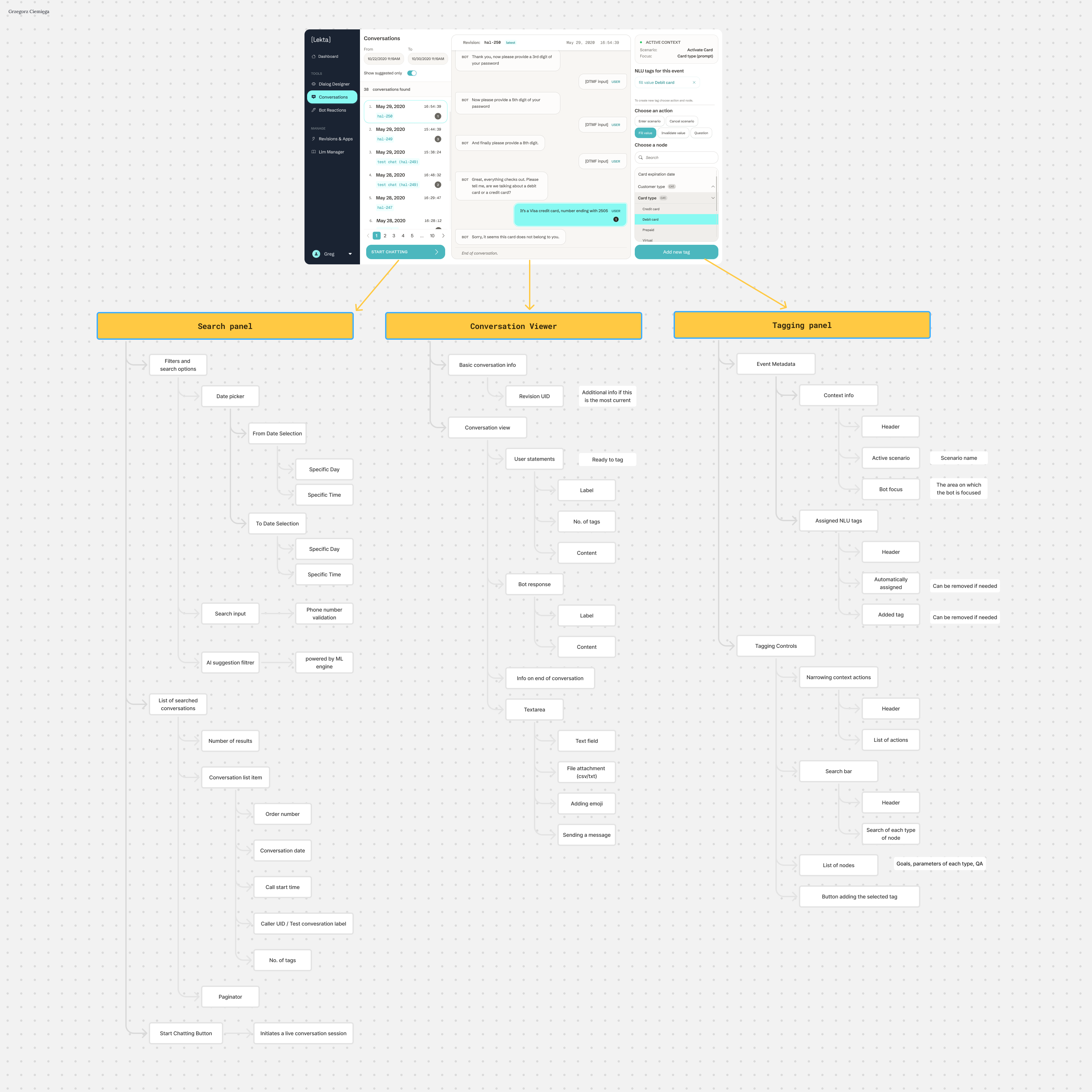
// process artifacts — from information architecture to hi-fi
click any frame to open it full-size
// key insight
Annotation shouldn't cover the thing you're annotating.
fig. 04
outcome
Context preserved
Annotators tag while seeing the conversation — the panel never covers the content being analyzed.
// the interface stopped fighting the task
Components adopted platform-wide
The categorized list and search component built here were reused in other parts of the platform.
// one module's fix became the platform's pattern
Consistent with the system
Typography, patterns and interaction behavior aligned with the rest of the platform — no more one-off module.
// consistency is a feature annotators feel, not see
fig. 05
reflections
What I'd tell you about metrics
We didn't run formal before/after measurements — the honest proof is the workflow change itself, visible in the screens. Where numbers don't exist, I don't invent them.
What this project taught me
I gained a working typology of conversational processes and how users search through large volumes of data — knowledge that shaped my later design decisions across the platform.
You made the whole team see that good process serves everyone.
Have a complex product that needs clarity?
Open to a long-term B2B contract, a freelance project, or a one-off consultation.
or reach me directly: