// case study · freelance · end-to-end delivery
Księgarnia Regionalna
A local bookshop with no website — brand, copy, design and code, shipped solo in four weeks.
view live site ↗Welcome to my bookshop in Góra Kalwaria
WHAT YOU'LL FIND
Welcome to my bookshop
- role
- Design · dev · copy — solo
- timeline
- 3–4 weeks
- scope
- 0→1 — brand, copy, design & code from scratch
- client
- Księgarnia Regionalna · Góra Kalwaria
- stack
- Next.js · Figma · v0 · Cursor
// problem
A beloved local bookshop had no digital presence — found only by word of mouth and Facebook. The only existing asset was a logo.
// approach
Build everything from zero: visual identity, tone of voice, page structure, copywriting and code — with an AI-assisted workflow to move fast.
// outcome
A complete, responsive website in four weeks — designed, written and built by one person, with a real-time 'open now' status computed in the browser.
fig. 01
context
Agata's bookshop has served Góra Kalwaria for years — school textbooks, regional literature of the Urzecze area, and a curated selection for every age. Despite a strong local reputation, it had never had a website; customers found it by word of mouth and Facebook. The brief was simple but demanding: build everything from zero. The only existing asset was a logo, which set the initial colour direction.
// who it serves
local students & parents
check textbook lists, ask for a title, know if it's in stock
regional readers
discover Urzecze literature they can't find in chains
agata, the owner
a site that sounds like her — she is product, service and personality
Literatura regionalna
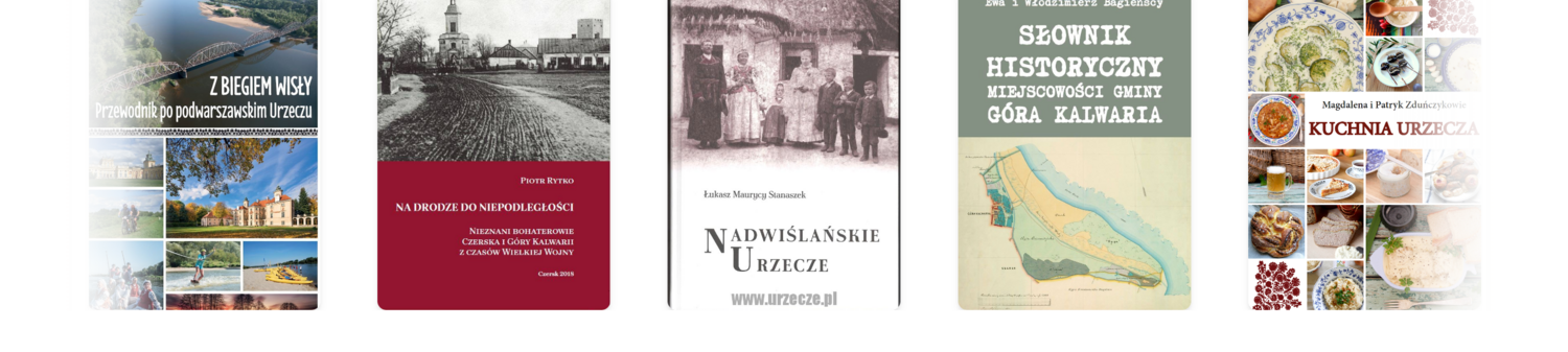
fig. 02
problem
Only a logo to start from.
A full brand, live in four weeks.
// what needed solving
- no starting point — only a logo
- a one-person shop needs a genuinely human voice
- regional Urzecze literature must feel accessible, not academic
- practical first: is it open? how to order? where is it?
- 3–4 week window, delivered solo
fig. 03
process
// reasoning trace — each step follows from the one before
Discovery with the client
Conversations with Agata were the foundation. Understanding her offer, her values and who her customers really are shaped every decision — structure, tone, and what the homepage needed to say.
Tone of voice & copywriting
I defined the voice before touching design: first-person, neighbourly, knowledgeable but never pretentious. Agata speaks directly — 'I know what local students need' — rather than hiding behind generic marketing language. All copy was written in this persona.
Design in Figma
I extracted the accent colour from the logo and built a warm, paper-inspired palette around it. Figma carried wireframes and final UI — section layout, typographic pairing, and visual details that emphasise the shop's regional character.
// design tokens — a warm system built from one logo colour
brown
#6b4327
accent · from the logo
espresso
#3f2817
headings & ink
paper
#f7f0e4
warm background
sage
#2f7d52
open-now status
taupe
#a08a6e
muted detail
display · serif
Zapraszam do
mojej księgarniwarm, personal, human — like the owner
body · sans
Od podręczników szkolnych po literaturę regionalną Urzecza.
clean and readable for the practical answers
Scaffold with v0, refined in Cursor
The Figma designs briefed v0, which produced a working React skeleton. From there everything moved into Cursor: custom logic, animations, responsive behaviour and the real-time status feature were written and refined there.
◈ more detail◈ collapse
This is the AI-assisted workflow I now use across projects: AI compresses the scaffolding, but every judgment call — layout, copy, interaction — stays human.
The real-time open status
The most practical feature: a status bar that tells customers at a glance whether the shop is open right now — and if not, when it next opens. No backend, no manual updates.
// real-time status — computed client-side, no backend
open now · until 6:00 PMclosed · opens Mon at 10:00 AMthe component compares local time against the weekly schedule — set once in code, always current
// key insight
For a one-person shop, the voice has to feel like her — not like an agency's idea of her.
// warm, local, direct — every section answers one real question.
fig. 04
outcome
A complete presence from zero
Brand, copy, design and code delivered as one cohesive whole — by a single person, in 3–4 weeks.
// one person, one voice, end to end
A voice that sounds like Agata
First-person, warm, local. Every section answers a real customer question — nothing is filler.
// no corporate distance, no marketing clichés
Utility built in, not bolted on
Real-time open status, one-tap call, clear ordering steps — the practical answers are up front, not buried.
// the homepage answers before you ask
fig. 05
reflections
Designing for someone else's voice
The hardest and most consequential decision was tone. For a shop where the owner is product, service and personality at once, the site has to feel like her — not like a brand agency's interpretation of her.
AI-assisted, human-led
v0 and Cursor compressed weeks of build into days — but discovery, voice and every judgment call stayed human. The speed was in execution, not in deciding what to build.
Want a site like this for your business?
I design and build the whole thing — brand, copy, UI and code — from a first conversation to a live, responsive page.
or reach me directly: